Project information
renovation and styling of a home in Amsterdam concept, styling and interior by The Style PaperThis was a challenging project: the renovation and styling of an entire floor of a house in Amsterdam. The Style Paper was there during the entire process, starting with making the first sketches and creating a moodboard, consultation with an interior architect and contractor and finally styling the interior.
The home in Amsterdam originally consisted of 2 separate houses which the previous owner had joined together. This meant that the lower floor existed of several smaller rooms and felt small and dark. The kitchen and furnishings were outdated. The Style Paper came up with a concept to create more space and modernize the house. After the heavy work, The Style Paper took care of the interior design.
How to start a renovation project? First, we consult with the owners. Based on this, we create a moodboard with a concept that functions as a basis for further talks with the architect and contractor. All this is done while keeping in mind the owners’ requirements, style and budget.
Light and spatious living roomThe style consultant started globally sketching ideas for the living room and kitchen. Important in this phase was to consider the required elements (enough storage space, a large stove, open space) and practical issues (we had to work around an electricity meter that could not be moved and had no room for the toilet). With these sketches and the moodboard, the interior architect could design a plan for the entire floor. In this case, he was also the connection to the contractor. Together with the architect, the style consultant made decisions on colors and materials for the kitchen, floor and walls.
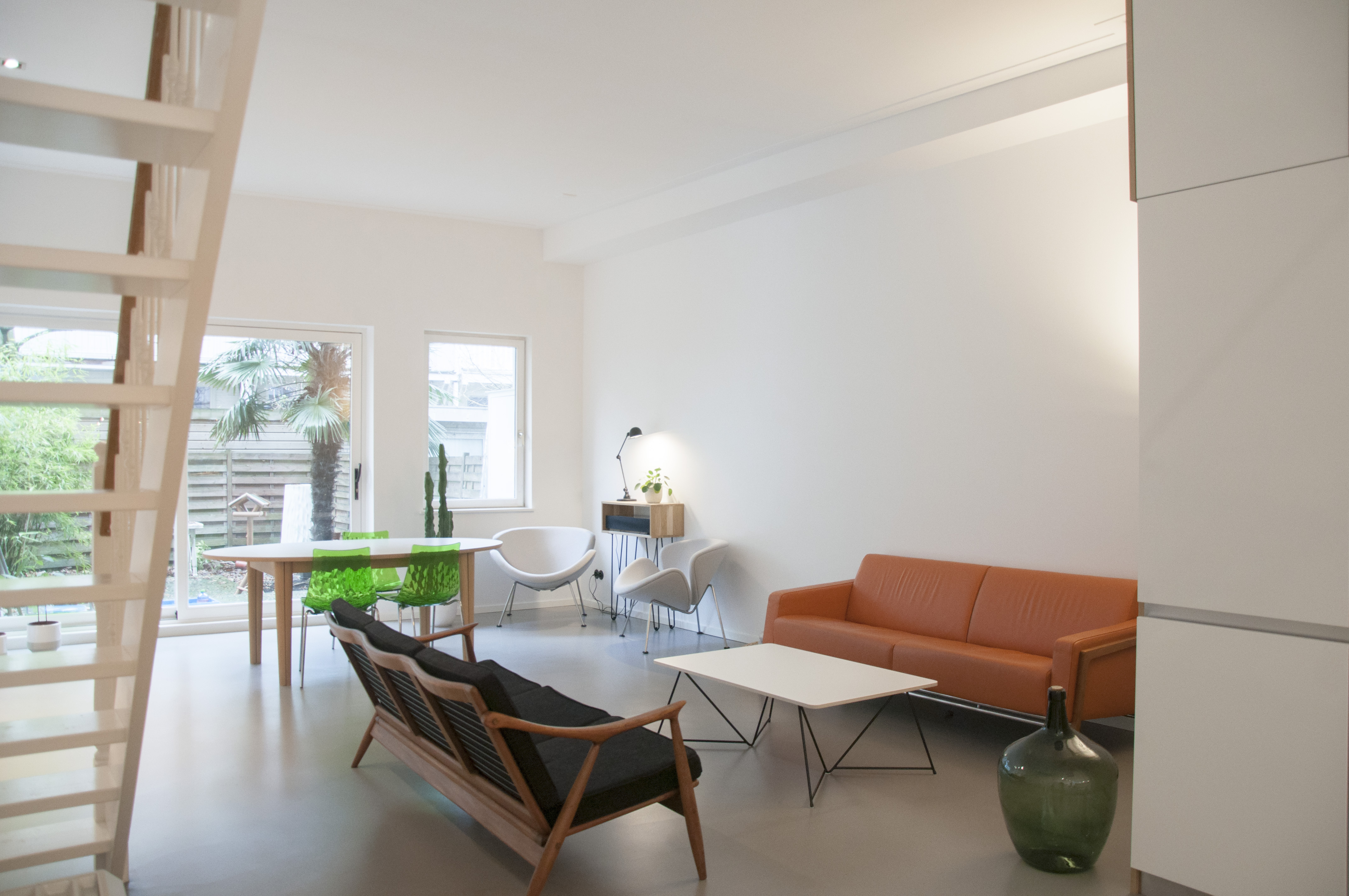
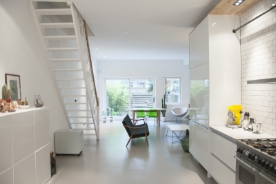
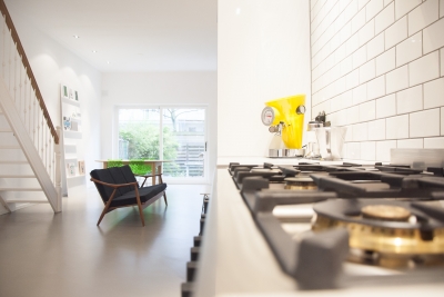
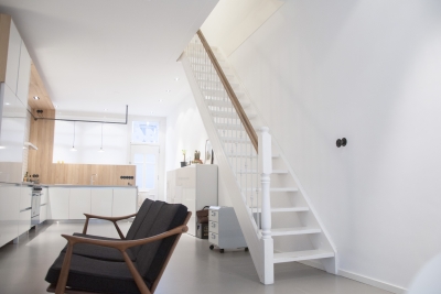
The result is a large open space allowing the light to flow in from both the front and rear of the house. Because there is no hallway, the kitchen was placed at the front (street side) and has a wall to prevent passersby looking inside and at the same time create a small hallway to keep coats and shoes out of sight. The kitchen has a modern industrial look with black steelwork, white metro tiles with dark joints and vintage looking bakelite electricity outlets. The toilet has been hidden behind the kitchen, underneath the neighboring house’s stairs and takes up little space. There is underfloor heating so no heaters have to be placed in the room and the floor is finished with industrial looking concrete. The walls have been kept white to keep the light and spacious feel, creating a blank canvas for some eye catching furniture.
The interior is a combination of design, vintage, budget and DIY furniture. Playful and modern but at the same time timeless.
Details
- Dutch design orange leather sofa by Harvink
- Mid century modern vintage wooden sofa from Denmark
- Danish design oak dining table by Skovby
- Monochrome coffee table with separate trestles and table top, both by Master&Master
- Green transparent dining chairs by Calligaris
- Orange Slice chairs by Pierre Paulin for Artifort upholstered in light grey wool
- DIY oak side table with hairpin legs
- DIY moodboard
- Kitchen and oak wall are custom made by Robert Tediek
